TONICA KOMBUCHA
STRATEGIC REPOSITIONING AND BRAND SYSTEM REDESIGN FOR NATIONAL GROWTH
Tonica had long earned its place as one of Ontario’s original kombucha brands. As the wellness category grew more crowded and design-forward, its positioning and packaging no longer reflected the strength of the product.
I was brought in to lead the repositioning across voice, packaging architecture, and visual identity. The goal was not reinvention. It was to protect what made Tonica distinct while building a system disciplined enough to scale.

• Strategic repositioning
• Brand voice development
• Packaging architecture and redesign
• Cross-functional alignment
• Creative direction across retail and digital touchpoints
• Development of brand tools and internal guidelines
LEADERSHIP SCOPE
• 200% sales growth in new post-rebrand markets
• Up to 30% overall sales increase
• Expanded into national retail partnerships
• Unified positioning across packaging, retail, and digital
• Clear brand tools supporting internal consistency and faster execution
THE IMPACT
Tonica’s product credibility was strong, but its story had grown diffuse. Voice, visuals, and messaging weren’t fully aligned, and the packaging no longer carried the clarity needed to compete.
The opportunity was to reconnect the brand’s emotional core with how it showed up on shelf and online. The brand didn’t need noise. It needed cohesion and conviction.
THE CHALLENGE
We repositioned Tonica around The Balance Seeker — a psychographic rooted in calm, conscious living, and modern ritual. This sharpened the brand’s emotional territory and clarified who it was truly speaking to.
From there, every decision was filtered through that lens. Voice became steady and confident. Messaging moved away from generic health claims toward presence and sensory experience. The brand stopped trying to keep up and began standing on its own ground.
Insights from sober curious culture and ritual-based wellness informed the shift. Tonica was no longer simply a functional beverage. It became a considered daily choice.
STRATEGIC FRAMEWORK
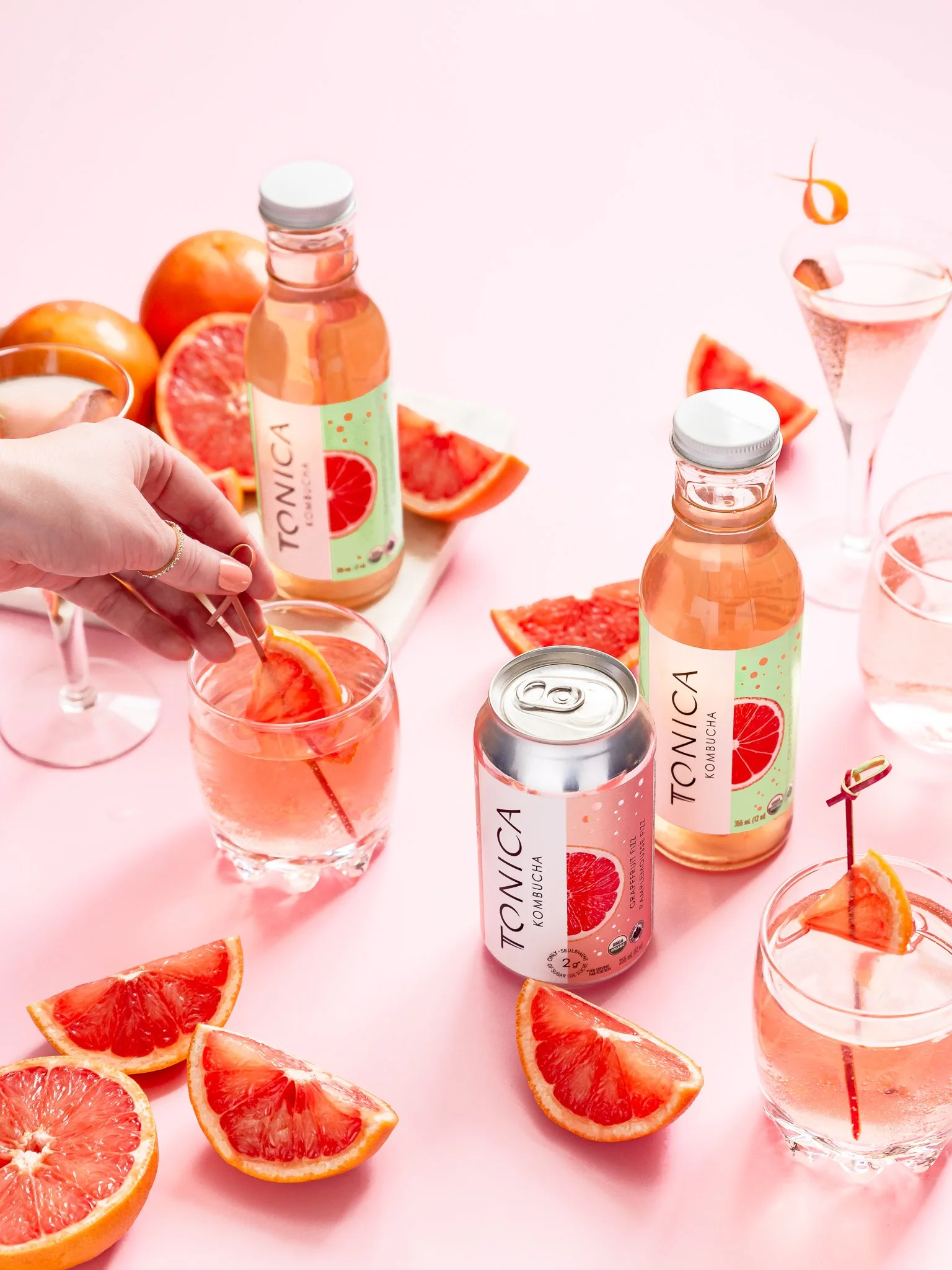
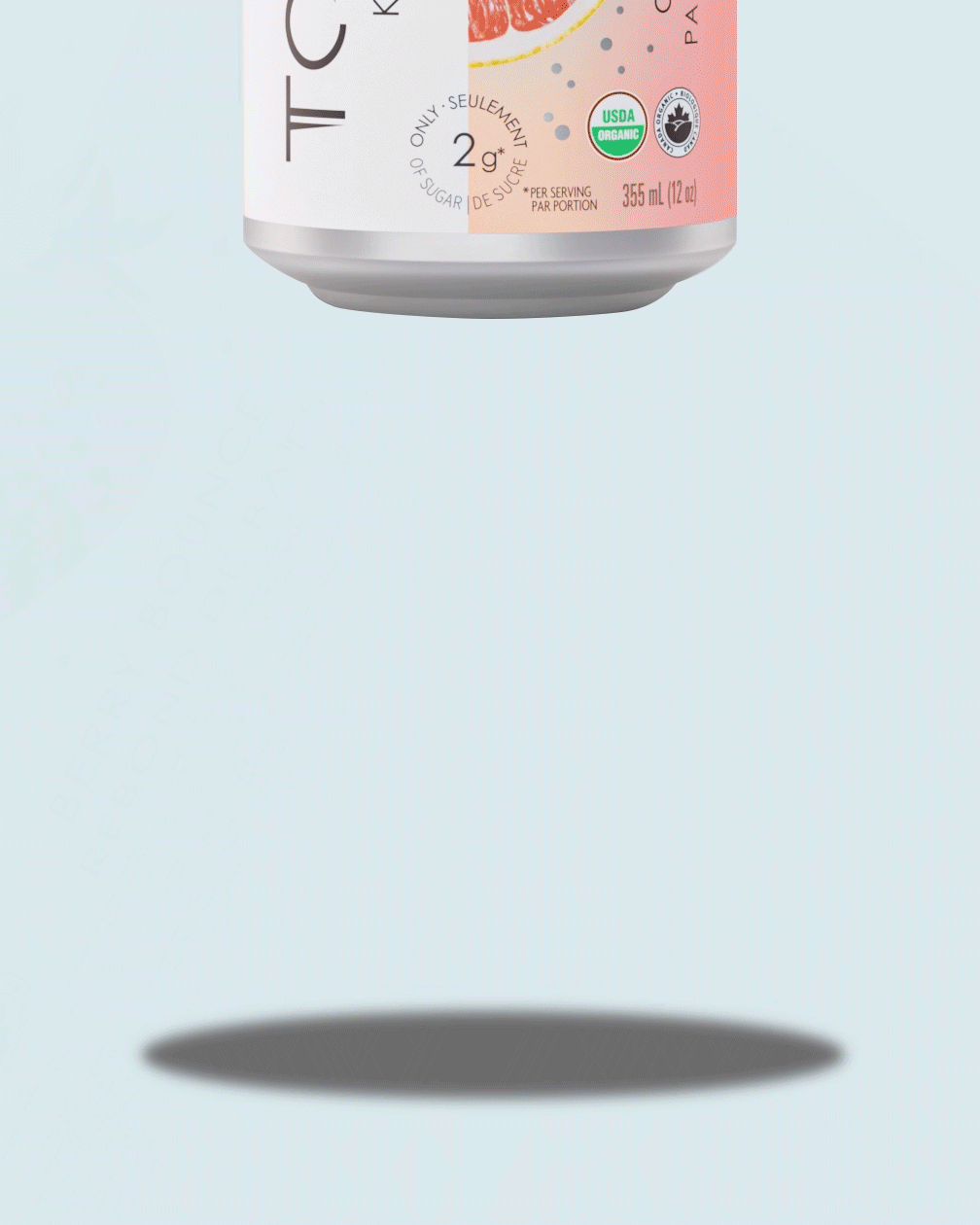
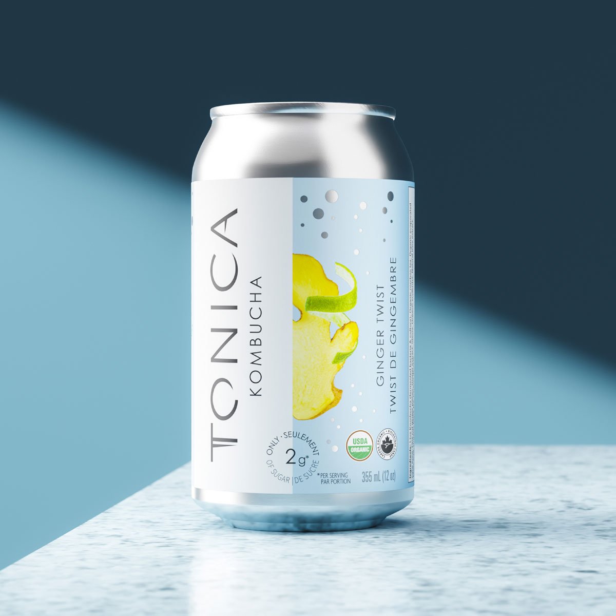
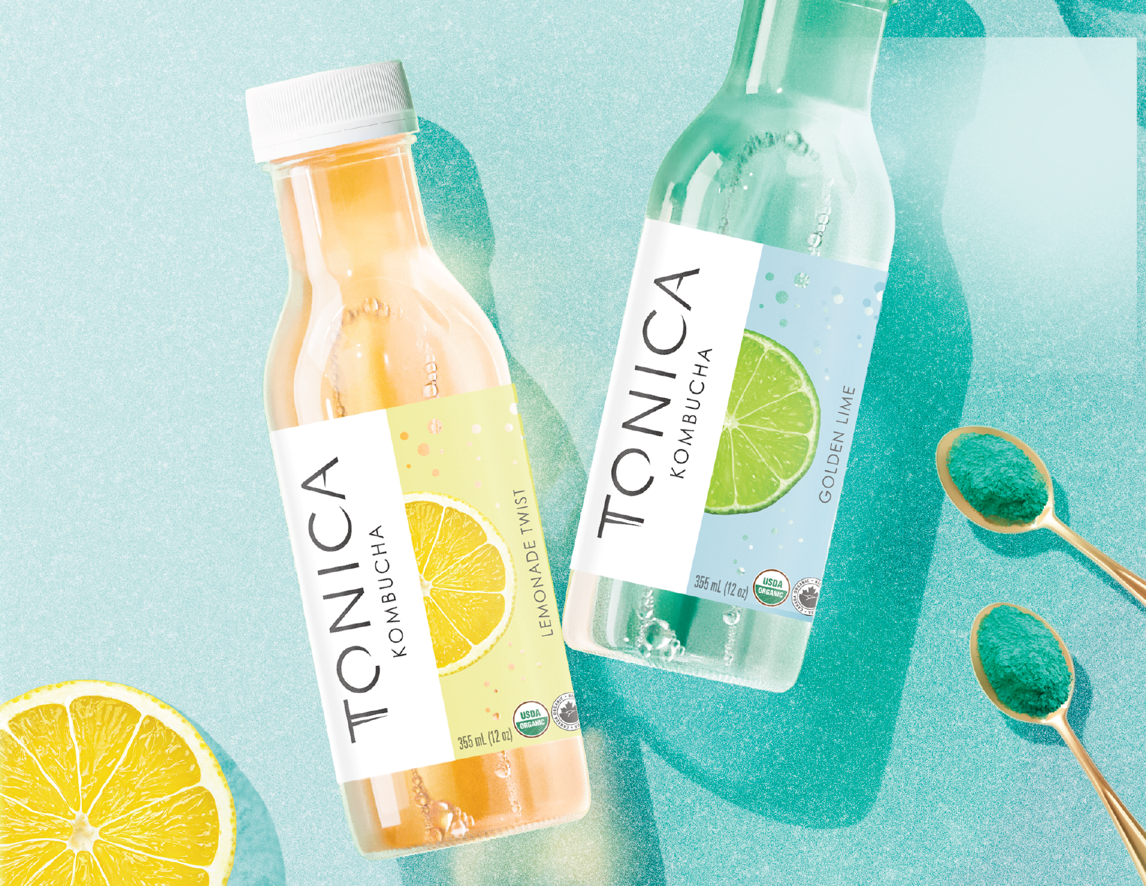
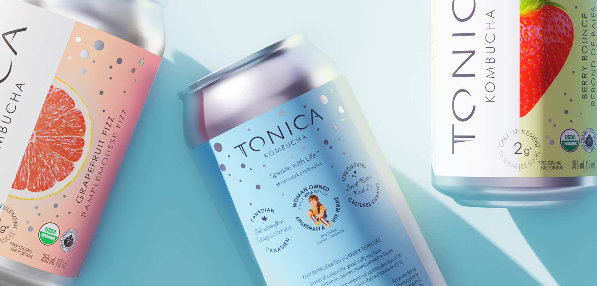
The packaging system was redesigned to prioritize clarity, navigation, and compositional balance. Flavor differentiation became intuitive. Hierarchy strengthened. Color architecture was disciplined to support recognition across SKUs and formats.
Typography and layout were refined to feel elevated without excess. The goal was not noise, but magnetism.
Beyond packaging, I developed a comprehensive brand brief, visual tone boards, and practical guidelines to ensure cohesion across retail, digital, and internal communications. The system was designed to scale and not just launch.