SAHAJAN
BUILDING A MODERN AYURVEDIC BEAUTY
BRAND WITH ROOTS
In Sahajan’s early stage, I partnered with founder Lisa Mattam to bring a clinically grounded Ayurvedic skincare line to market. The goal was to translate South Asian heritage and pharmaceutical rigor into a brand that felt premium, modern, and immediately trustworthy to North American consumers.

LEADERSHIP SCOPE
Brand naming and positioning
Visual identity system
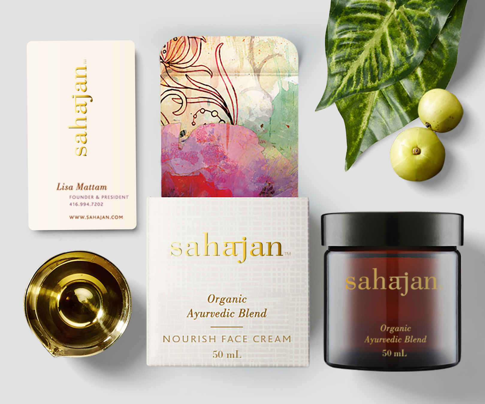
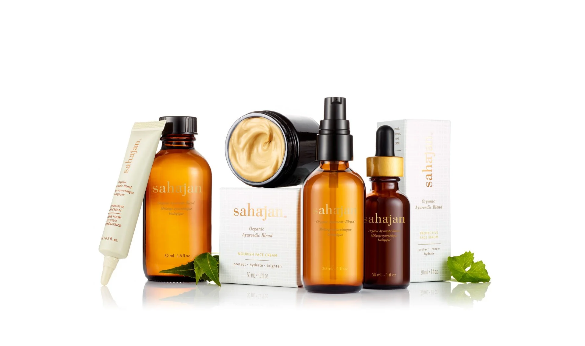
Packaging architecture and SKU system
Art direction across packaging and brand imagery
Creative direction and standards for rollout assets
-
Ayurveda was underrepresented in North American prestige skincare. We needed to introduce a new logic of beauty without overexplaining it. The brand had to communicate heritage and efficacy in a single glance, while competing beside established clinical and luxury players.
-
We built the brand on a simple tension: ancient knowledge, modern proof.
Every element had to signal credibility first, then depth. The system was designed to invite curiosity without feeling niche, and to support growth across new products without losing coherence. -
The identity balanced restraint and warmth through a refined wordmark, a disciplined typographic hierarchy, and a neutral, earth-led palette that felt premium rather than “wellness craft.” Packaging was structured for fast navigation and scalability, with a consistent architecture that could expand across formats and SKUs while keeping the shelf read clean and confident. Art direction reinforced that same promise: modern, tactile, and clinically composed.
THE IMPACT
Established a premium, credible Ayurvedic brand presence for North American retail
Created a scalable identity and packaging system designed for portfolio growth
Built a cohesive brand foundation that supported later retail expansion and recognition