MISFITSTUDIO
BUILDING A HEART LED FITNESS BRAND WITH CULT FOLLOWING ENERGY
Misfitstudio was built to stand apart from mainstream fitness culture. I partnered with founder Amber Joliat early to translate her vision into a distinct brand identity and a visual system that felt raw, magnetic, and emotionally resonant.
My role was to create the foundational brand platform and direct the visual language across key touchpoints, giving the studio a clear point of view, a recognizable symbol, and a system designed to scale.
LEADERSHIP SCOPE
Brand positioning and identity direction
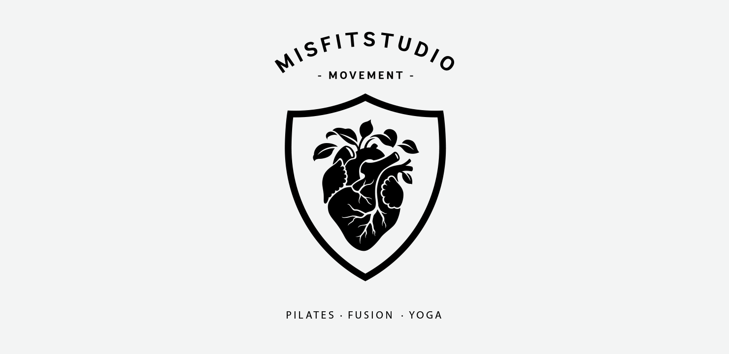
Logo and visual system development
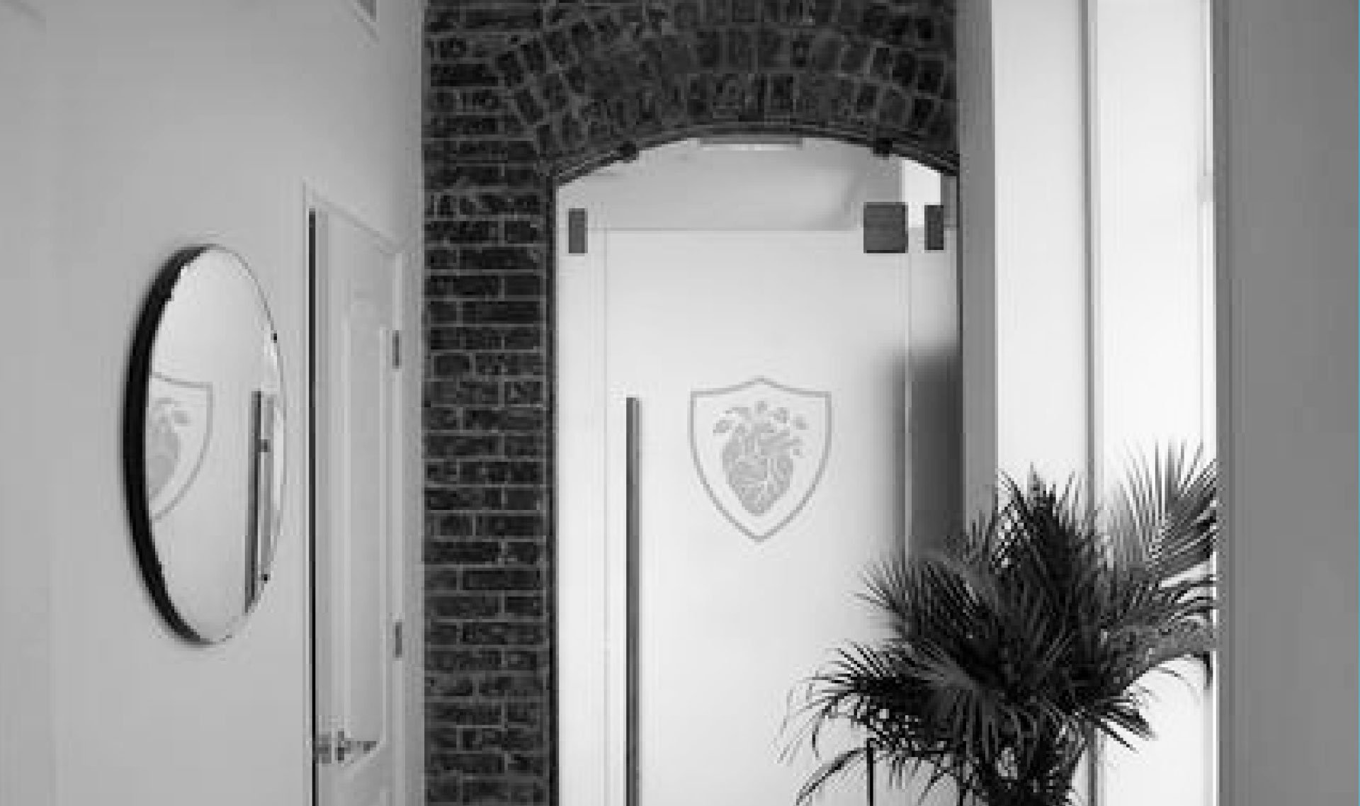
Environmental and studio graphics
Merchandise and community touchpoints
Social and digital brand expression
-
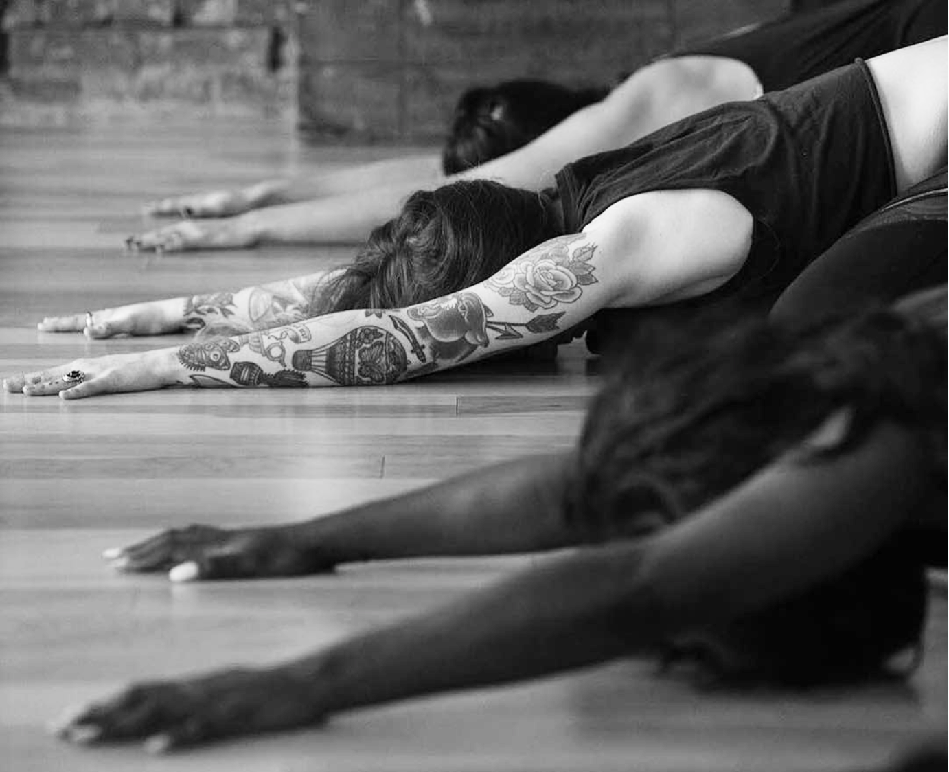
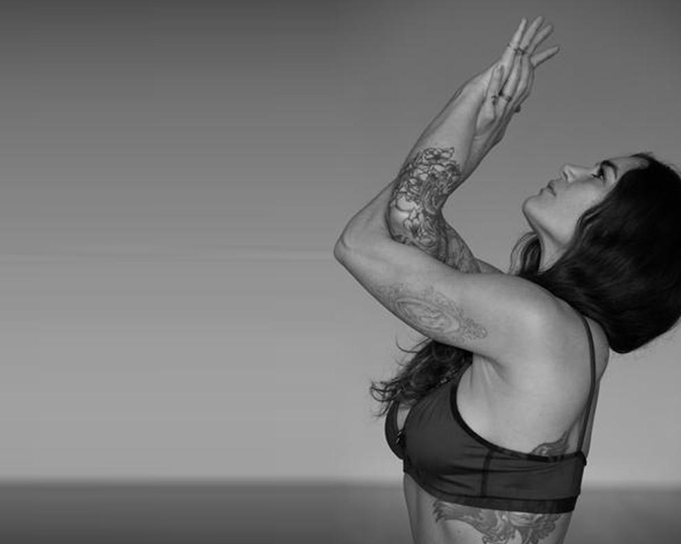
Amber’s offering blended intuitive movement with high performance training, attracting a community that wanted something more personal than traditional fitness. The brand needed to feel like a place people belonged, not a studio competing on trends. It also had to signal credibility and intention while staying bold enough to stand out in a crowded market.
-
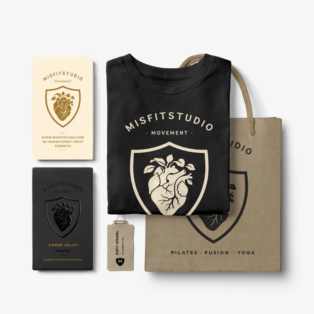
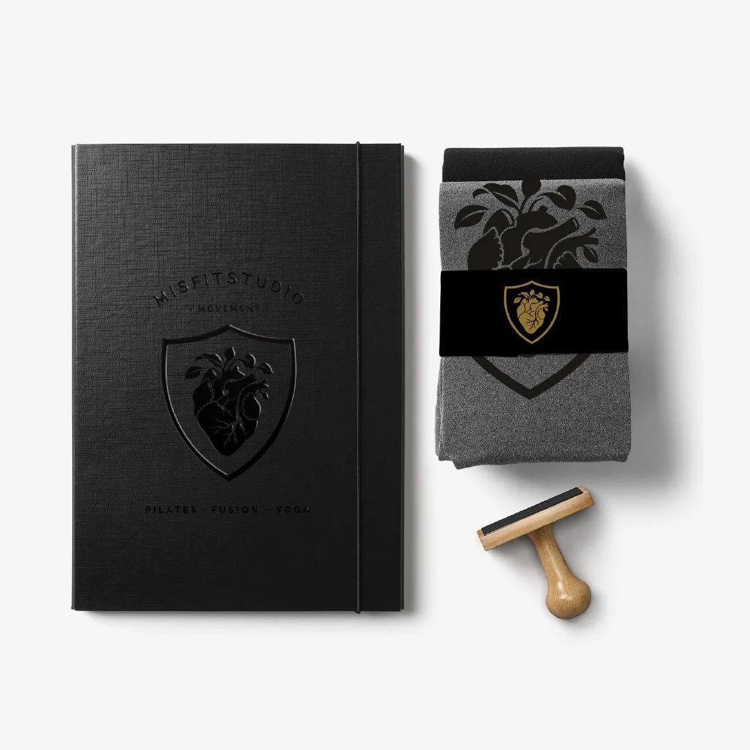
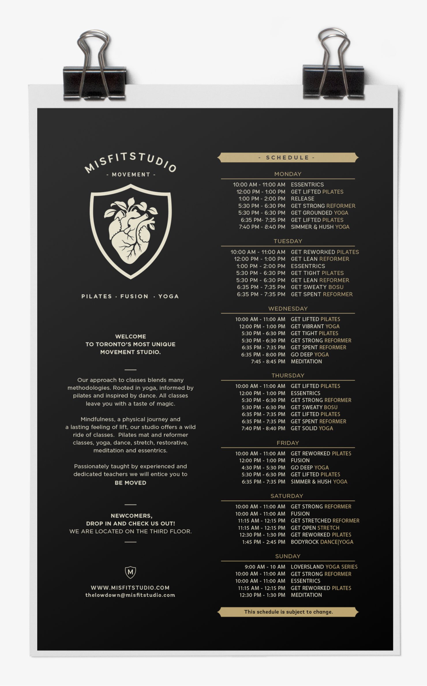
I built the brand around a singular, ownable symbol: an anatomical heart emblem that became a recognizable anchor across the studio experience. The visual language drew from anatomical study and tattoo culture, giving the brand edge and emotional depth without losing clarity or usability.
From there, I developed a cohesive identity system designed for real-world application, including typography, layout behavior, and assets that could live consistently across signage, merchandise, community events, and digital channels. The system created a strong point of view while remaining flexible enough to support growth.
THE IMPACT
The positioning attracted a new community of movers who wore the brand with pride. The heart emblem became a recognizable signature across the studio and beyond, showing up on successful merchandise drops and, for some members, even as tattoos. Misfitstudio grew from one location to three in just over five years, while the identity system kept the experience cohesive as the business scaled.