HANDFUEL
BUILDING A SNACK BRAND THAT LOOKS AS GOOD AS IT TASTES
In 2015, before “Instagrammable” became a retail strategy, we noticed something important: millennial consumers were responding to disciplined visual repetition, bold shadow and light, and highly styled food compositions online.
While legacy snack brands relied on tired commodity packaging, social media was proving that aesthetics were driving appetite.
Handfuel had premium ingredients but no distinctive visual language. We reimagined the brand from the shelf outward and translating digital-era visual behavior into a scalable CPG system that signaled health, indulgence, and lifestyle credibility simultaneously.
What began in Circle K evolved into national grocery, convenience, and Amazon distribution.

• Brand repositioning and visual strategy
• Packaging architecture and SKU system design
• Omnichannel brand ecosystem development
• Retail expansion and scale readiness
• Cross-functional creative direction
LEADERSHIP SCOPE
• Over 600% revenue growth within two years of relaunch
• Expanded from regional convenience placement to national grocery and convenience chains
• Established a scalable packaging architecture supporting rapid flavor innovation
• Increased repeat purchase driven by elevated shelf presence
• Unified digital and retail identity, strengthening brand recognition across platforms
THE IMPACT
THE CHALLENGE
The premium snack category was visually homogenized. White bags, product photography without art direction, and generic health cues dominated shelf space.
Handfuel offered superior ingredients but lacked the brand architecture to command premium positioning or emotional connection. Competing against legacy peanut brands and bulk “healthy” players like Prana required more than better ingredients. It required distinction.
The mandate was clear: create a brand system that generates desire before the first bite and scales across retail environments.
STRATEGIC FRAMEWORK
Rather than follow CPG convention, we looked to culture.
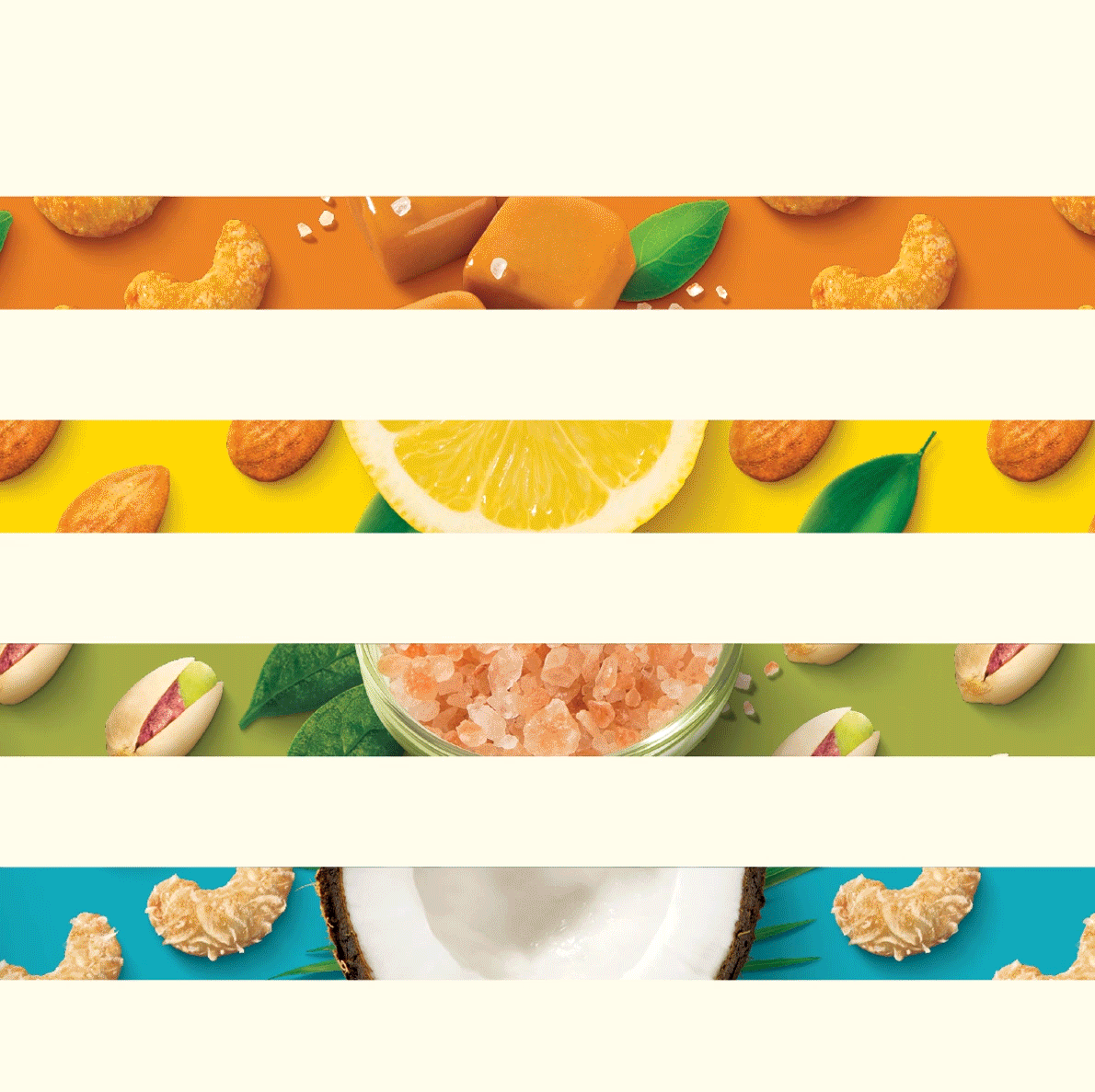
Instagram was already demonstrating what millennial consumers found aspirational: rhythmic repetition, graphic food arrangements, confident color blocking, and a balance between indulgence and wellness.
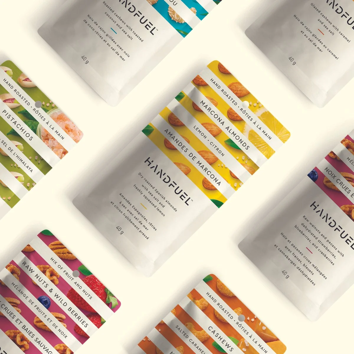
We translated those digital behaviors into physical packaging — treating every SKU as a visual tile in a larger shelf composition.
The strategy reframed Handfuel from functional nutrition to lifestyle enhancement. Health remained credible, but the aesthetic drove impulse and social sharing.
This was not a packaging refresh. It was a repositioning designed for modern visual literacy.
SYSTEM EXECUTION
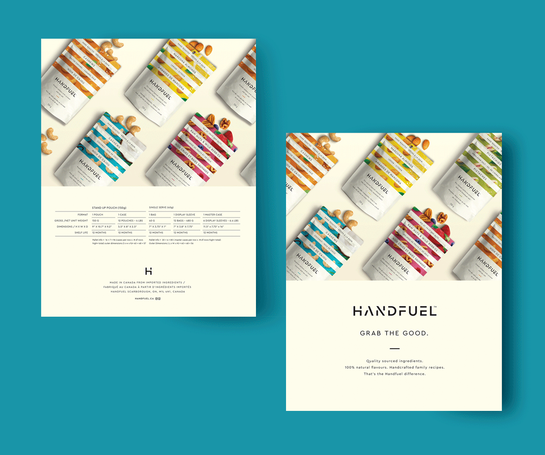
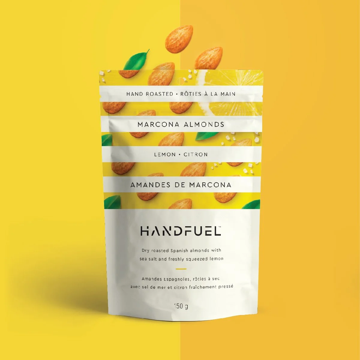
The brand identity was built from a modular packaging architecture anchored by bold horizontal color bands.
The system:
• Created immediate shelf blocking and flavor navigation
• Elevated perceived quality through refined typography
• Photographed beautifully, encouraging organic social amplification
• Scaled seamlessly from convenience singles to club formats
• Supported ongoing flavor innovation without diluting brand equity
Every touchpoint from website, retail presentations, social content was reinforced the same confident visual language.
What had been anonymous white packaging became a recognizable brand system capable of expansion.