GLENN’S EDIBLES
A RIPPLE EFFECT IN CANADA’S EDIBLE MARKET
In a highly regulated cannabis market where traditional advertising is restricted, brands cannot rely on claims, media weight, or conventional storytelling. They must earn recognition through design, product experience, and community.
For Glenn’s, the strategy was clear. If we could not amplify messaging, we would amplify the product itself.
As creative director and brand lead, I oversaw strategy, packaging architecture, product design, merchandising, and retail activation from concept through expansion. Every decision was designed to make the gummy unmistakable.
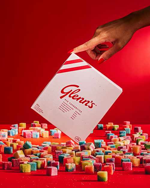
From its proprietary ripple texture to a character-driven brand world, Glenn’s did not just enter the category. Glenn’s did not just enter the category. It introduced a distinctive product language within it.
LEADERSHIP SCOPE
• Brand positioning and voice
• Packaging architecture and product design
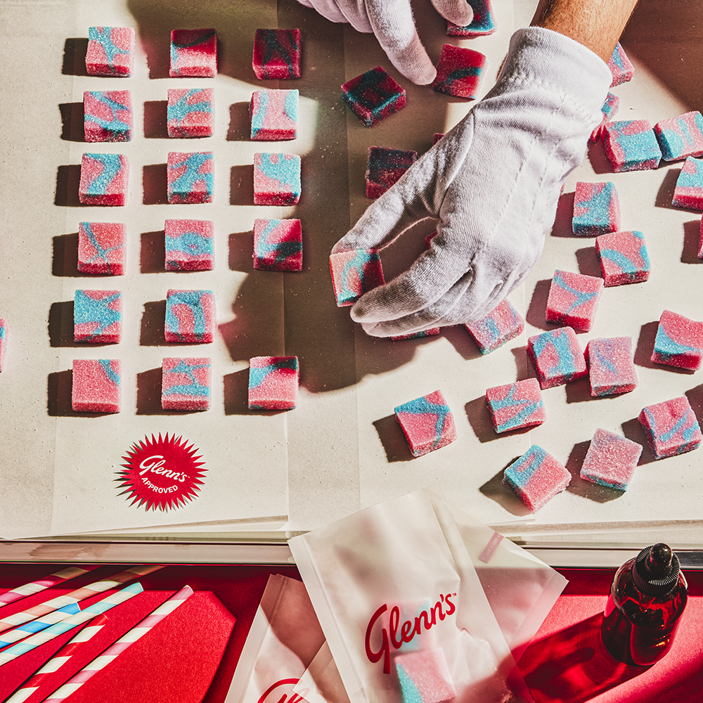
• Proprietary gummy texture development
• Retail and merchandising system
• Sales tools and brand standards
THE IMPACT
• Achieved sustained year-over-year growth following launch
• Expanded distribution across multiple provinces
• Positioned among Ontario’s top-performing gummy brands
• Repeatedly featured by the Ontario Cannabis Store (OCS) across retail and editorial placements
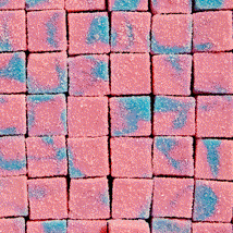
• Distinctive ripple-textured gummy drove strong UGC and organic social visibility
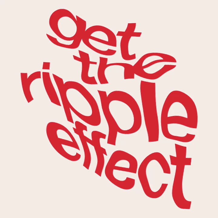
• Visual alignment between ripple texture and “Get the Ripple Effect” strengthened brand recall
• Elevated consumer perception from generic candy to premium edible experience
• Strengthened retailer confidence through disciplined packaging architecture and merchandising tools
Glenn’s was entering a tightly regulated and highly competitive cannabis edibles market. Advertising restrictions limited traditional brand building, while established competitors dominated shelf space and retailer attention.
The business mandate was clear:
maximize sales velocity, expand geographic reach, and build awareness among both retailers and consumers.
At the same time, the brand needed to differentiate itself from generic “candy” positioning and establish credibility around texture, flavor, and rosin quality.
In short, Glenn’s had to stand out in a market where you cannot say much, cannot advertise freely, and cannot rely on mass visibility.
THE CHALLENGE
The strategy focused on making the product itself the primary brand signal.
If we could not lead with claims, we would lead with form.
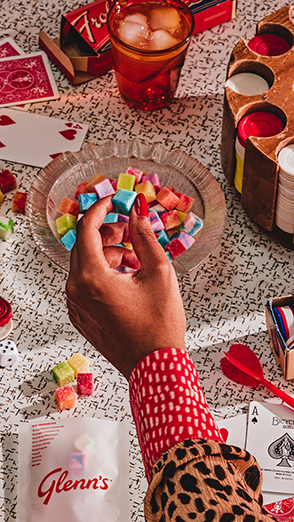
We developed a proprietary ripple-textured gummy designed to be visually distinctive, tactilely memorable, and easily repeatable in conversation. “The ripple effect” became more than a tagline. It was a physical brand asset.
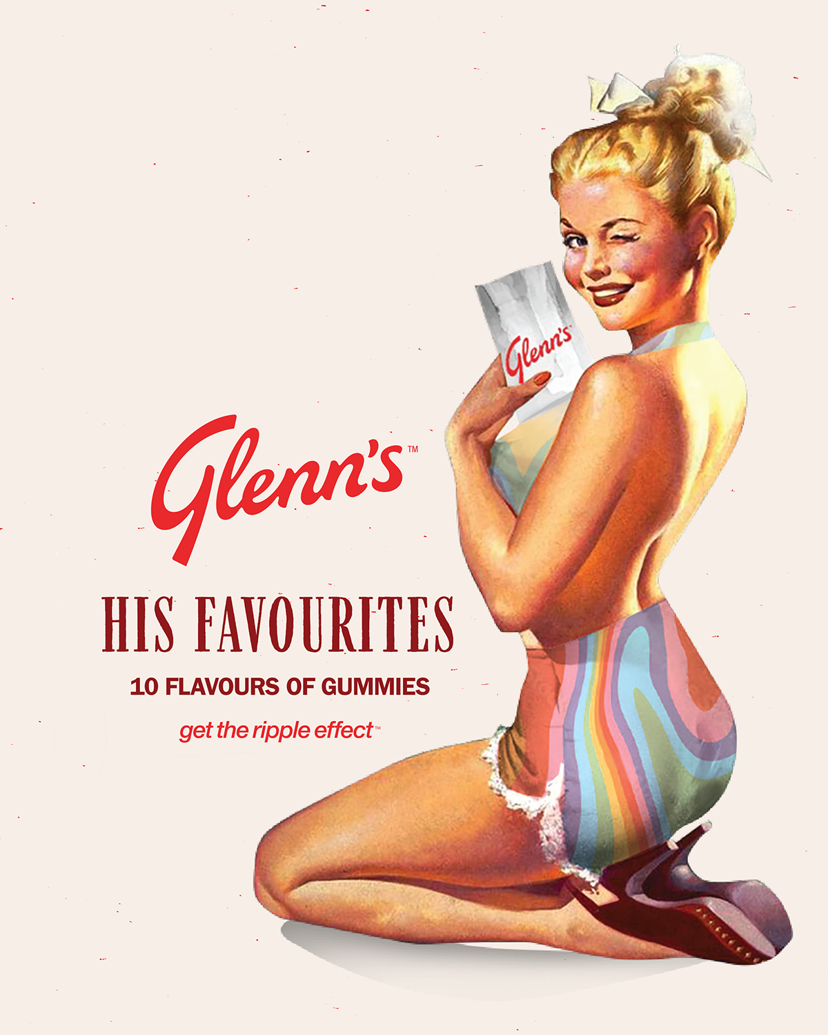
Around that core, we built a retro-inspired but disciplined brand system that balanced nostalgia with quality cues, reinforcing Glenn’s as a premium edible rather than novelty candy.
Every decision was filtered through three lenses:
recognition, compliance, and scalability.
STRATEGIC FRAMEWORK
I led the development of a full brand and packaging architecture designed to scale across SKUs and provinces.
This included:
• Proprietary gummy design and texture development
• Packaging system built for shelf clarity and regulatory compliance
• Distinctive color architecture to support flavor navigation
• Retail merchandising tools and sampling strategy
• Founder-facing sales materials and brand standards
• Content direction aligned to character-driven storytelling
The ripple texture became the unifying visual and tactile identifier across product, packaging, photography, and retail moments. The system ensured that even within strict regulatory frameworks, Glenn’s could maintain cohesion and distinction.