FINE TUNE PILATES
A BRAND SYSTEM SCALED A BOUTIQUE PILATES STUDIO WITHOUT LOSING IT’S INTIMACY
Fine Tune Pilates began as a private, referral driven practice. The founder’s next move was growth: a larger, more visible Toronto studio and a brand that could attract new clients while still feeling personal and premium. I led the brand foundation and creative direction to position Fine Tune for expansion across spaces, channels, and audiences.
LEADERSHIP SCOPE
Brand positioning, naming, and narrative
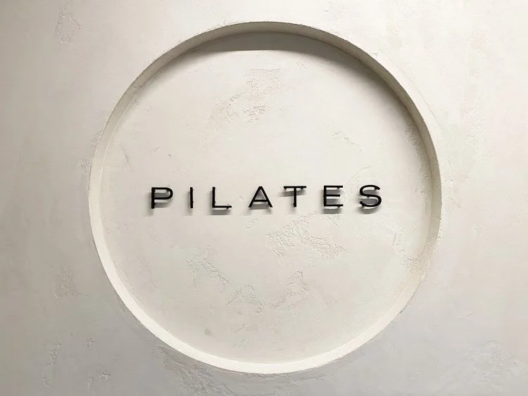
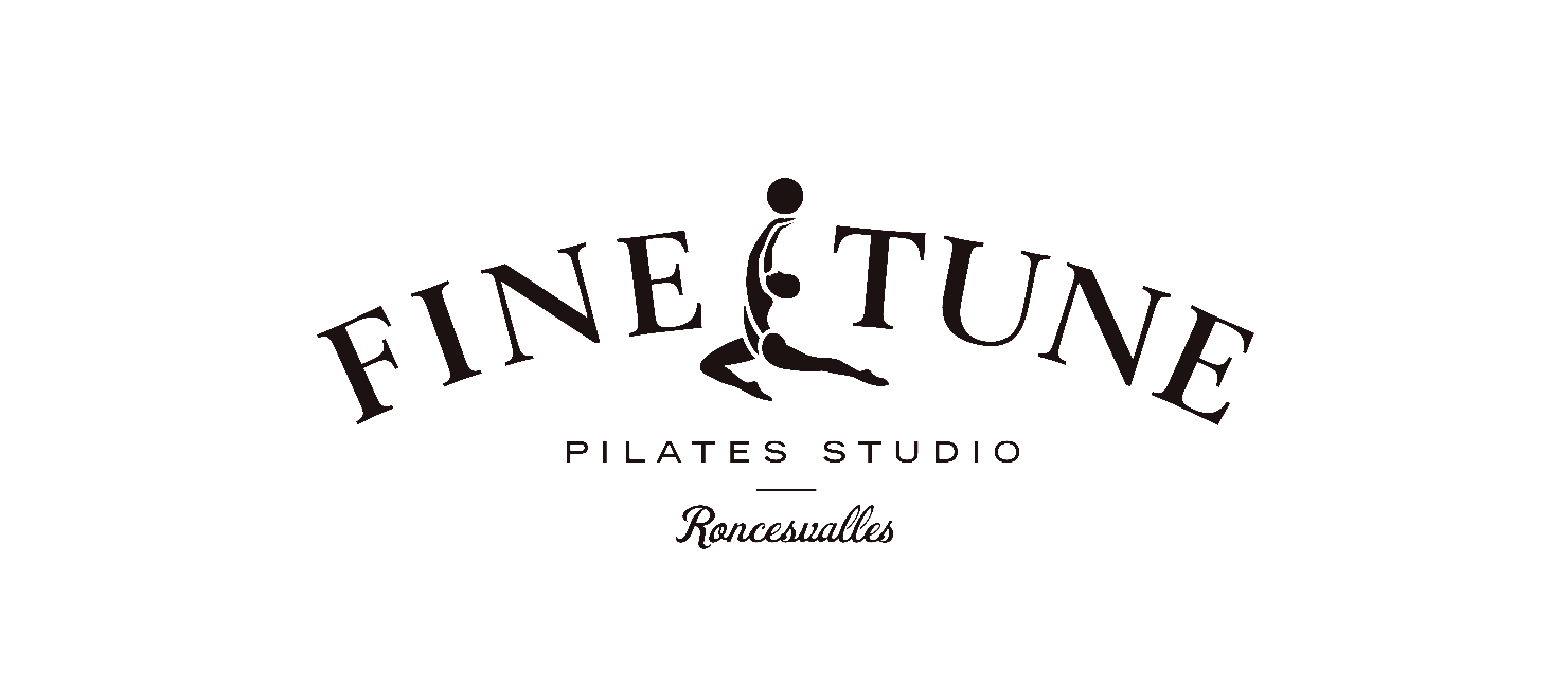
Visual identity and design system
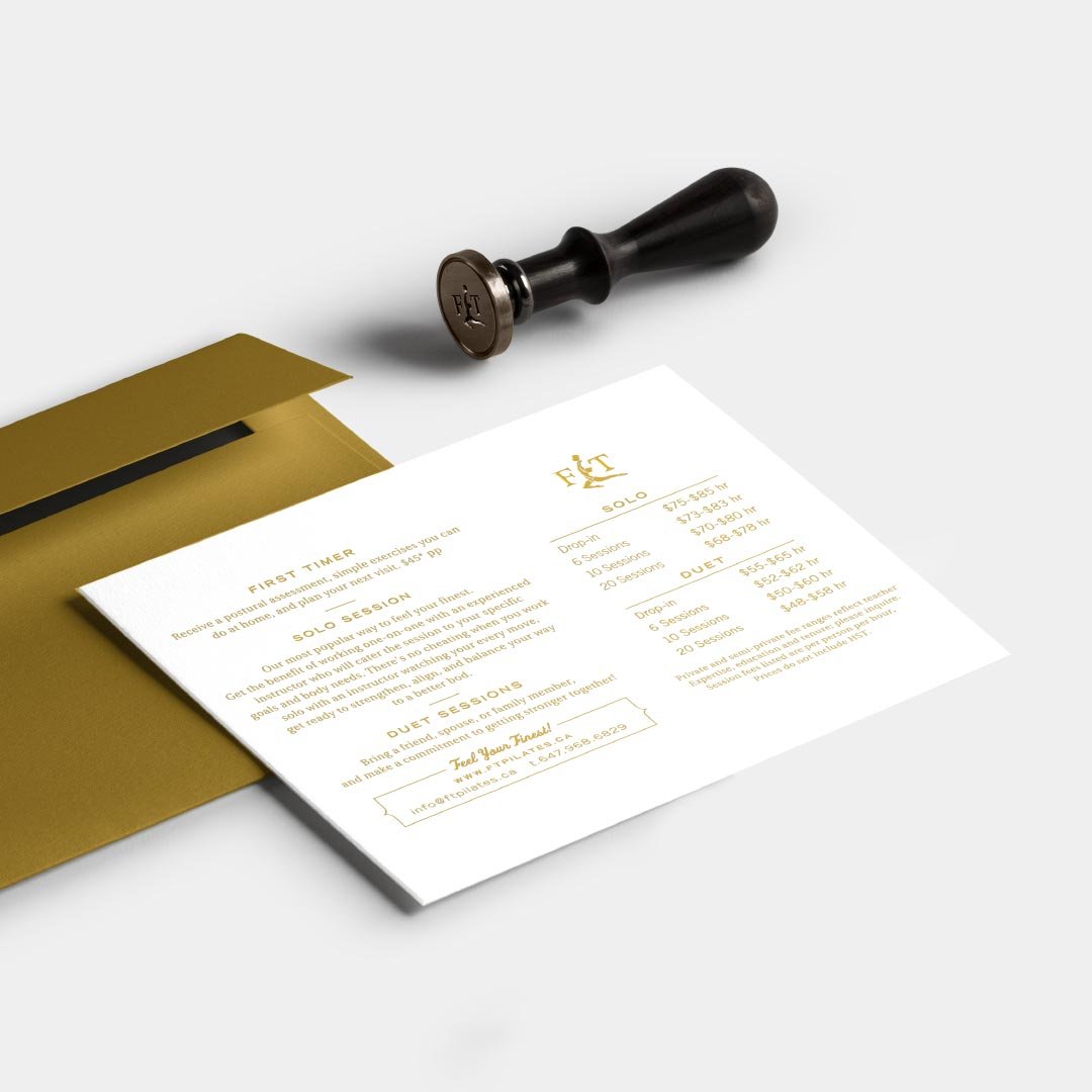
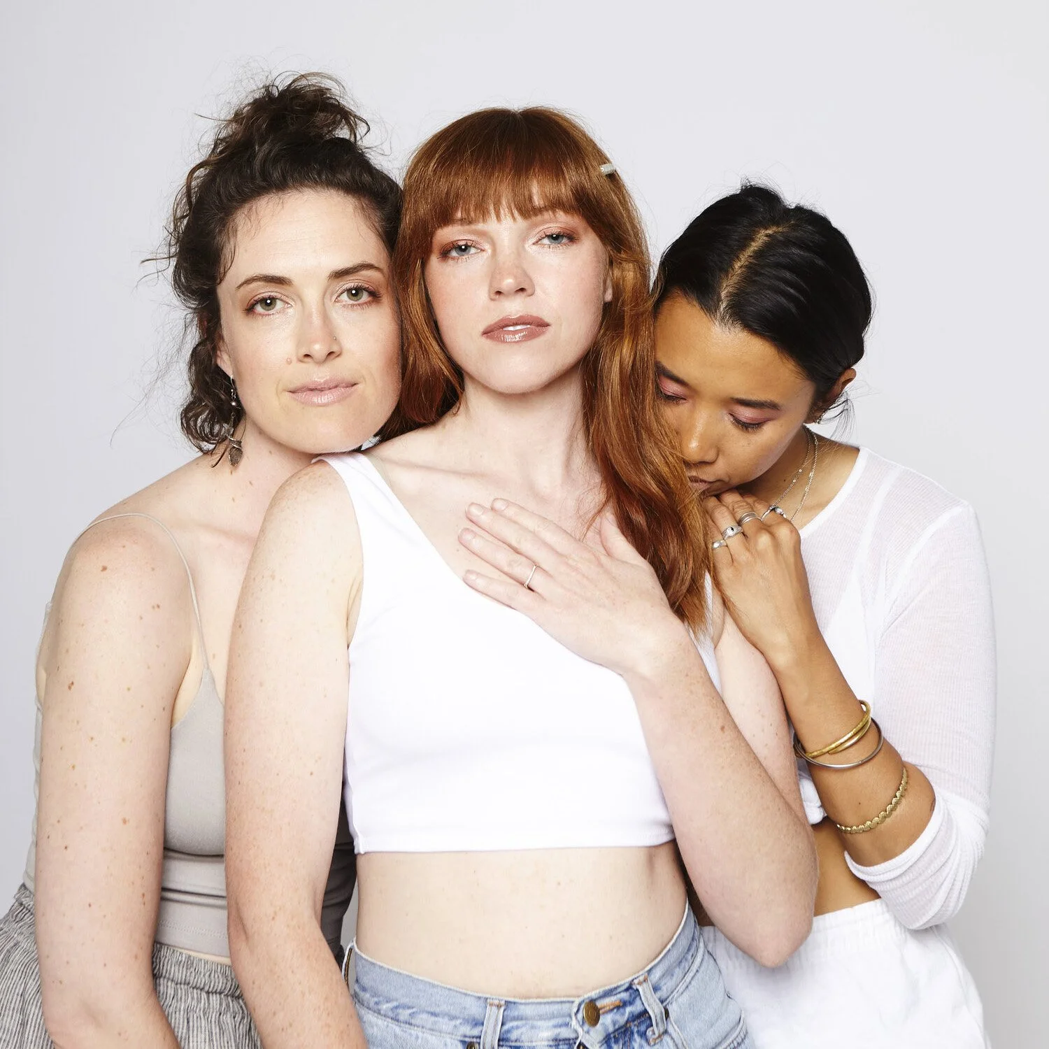
Art direction for photography and content style
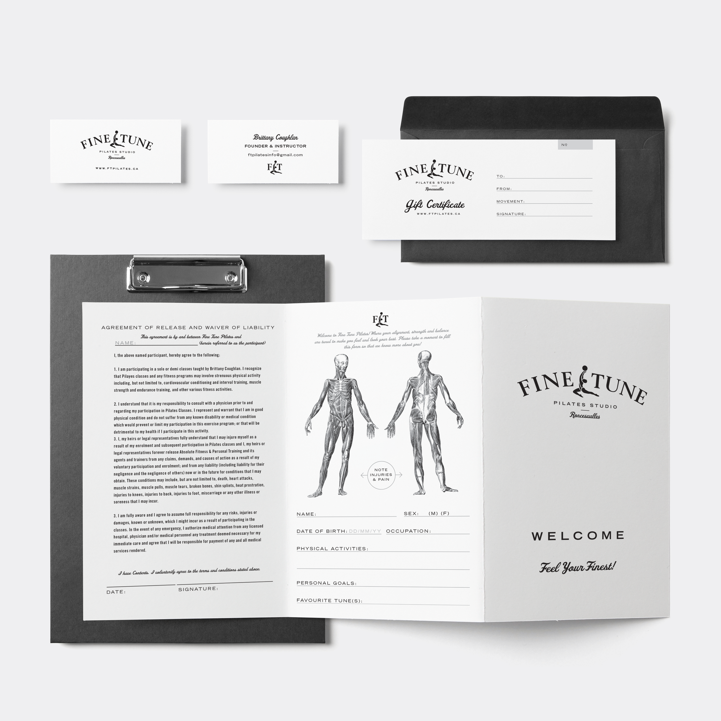
Merch and promotional collateral direction
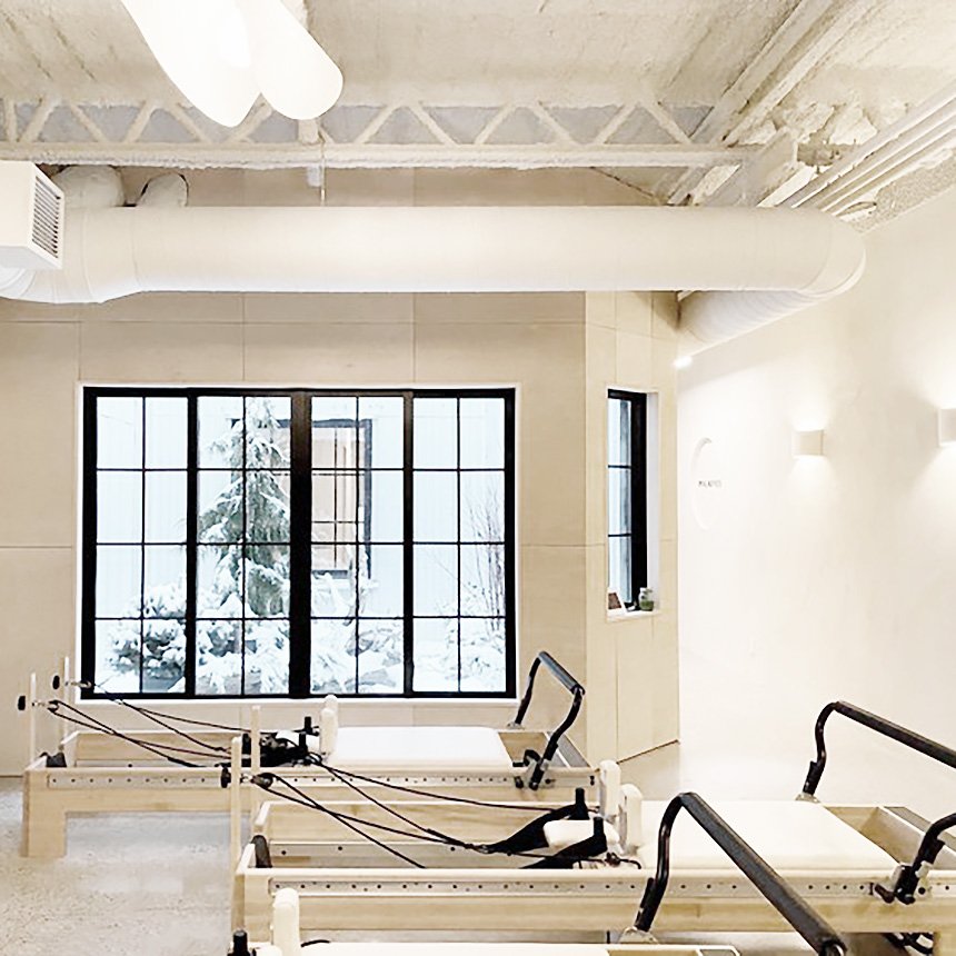
Environmental guidance for in studio brand expression
Creative guardrails to keep future content consistent
-
The brand needed to hold two truths at once: high touch expertise and broader market visibility. It had to feel elevated but not exclusive, local but not small. The audience was diverse, spanning longtime one on one clients and new discovery driven customers. The identity needed to work on signage, print, social, and in studio experiences, with enough structure to scale.
-
I built a brand platform around precision, warmth, and confidence. “Fine Tune” became the organizing idea: a name that signals both physical calibration and craft. From there, we established a visual and verbal system designed to feel modern, human, and durable across changing wellness trends.
-
Naming and core story
Fine Tune positioned the studio as a place for intelligent movement and personal transformation, grounded in expert instruction.Identity system
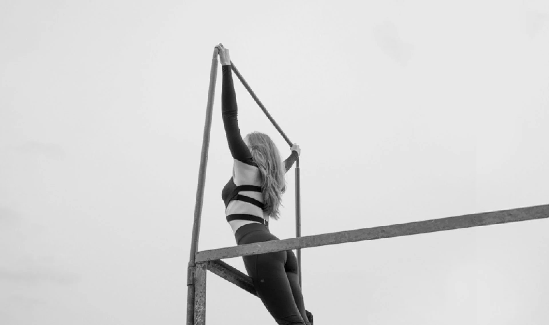
A clean, confident mark and typographic approach that reads premium in the neighborhood, on storefront signage, and in digital environments.Art direction
Photography direction focused on real presence and strength, avoiding generic wellness imagery. The goal was credibility and emotional clarity, not trend.Touchpoints
Merch, in studio materials, and promotional assets were treated as part of one cohesive system, so the brand looked consistent whether someone discovered it online or walked past the studio.
THE IMPACT
Elevated the studio from boutique practice to premium, scalable brand expression
Established a disciplined identity system for signage, print, and digital consistency
Set art direction standards that avoided generic wellness cues and reinforced taste and credibility